
bolo da Bia
mobile app
Bolo da Bia is a family-owned Brazilian bakery, is dedicated to delighting its local community with delectable custom desserts. They strive to streamline the dessert ordering experience for anyone that is planning personalized treats for their memorable occasions.
Role: UX Researcher, UX Designer.
Tools: Figma, FigJam, Miro, Adobe Creative, Google Suite,
Timeline: 4 months
Process: Research, Ideation, Prototyping, and Testing. Repeat.


overview
Welcome to the cake ordering world! It can be confusing and frustrating sometimes. From limited options to clunky interfaces, we've seen it all. But I'm here to change that. In this project, I'll talk about the problems people have and show you my idea for a new cake ordering mobile app. It'll make ordering a piece of cake. Say goodbye to confusion and hello to a sweet new way to order your dream dessert!
Problem Statement
Current cake ordering processes lack efficiency and personalization, leading to customer frustration and potential business loss. There's a need for a streamlined and user-friendly app that simplifies the customization and ordering experience for customers while optimizing operations for the bakery.
The Goal
Our goal is to make ordering your favorite desserts a piece of cake! Let's say goodbye to long lines and confusion at the bakery. This mobile app will be a dessert genie, guiding user through the menu with ease and giving them a hassle-free ordering experience.
Solution
With a focus on user experience and seamless functionality, this mobile app will provide a platform where customers can easily design and order custom cakes tailored to their preferences. From choosing flavors, to selecting decorations and themes, the app will offer a wide range of options to cater to every taste and occasion. Additionally, features such as real-time order tracking, secure payment options, and personalized recommendations will enhance the overall user experience, making the cake ordering process both convenient and enjoyable.
I want to make sure customers have the best experience and make their brand the top choice for special custom cakes.
EMPATHIZE
Sweet hunting:
researching the competition
By looking at what other competitors businesses are good at and where they could do better, companies can find ways to improve, mistakes to avoid and stay ahead. In my study, I checked out three small, family-owned bakeries nearby and one big chain bakery. Here's what I found out:

Many local bakeries rely solely on websites without offering dedicated apps.
Overwhelming and not intuitive design.
Insufficient guidance on how to personalize the dessert.
Limited information recommended dessert sizes/quantity X party size.

Choices for order customizations.
Clear and well-organized menus simplify option navigation.
Offer recommendations on flavor, dessert size, quantity.
Efficient and straightforward checkout process.
Sweet Secrets from Dessert Lovers
HOw might we…?
I kicked things off by having a chat with customers at nearby bakeries— the ones who have a sweet tooth and indulge in dessert orders at least every other month. I dug into their routines, how they place orders, and the hurdles they encounter along the way during the ordering process.

How might we streamline cake ordering and customization seamless, ensuring each customer's
unique vision comes to life through our app?
DEFINE
Let's meet our persona
Marcela, the super mom.
Our research journey into understanding bakery customers led to the creation of one main distinct user personas, informed by interviews, surveys, and observation. Marcela, "the super mom," emerged as a time-strapped professional who values convenience and quality. Crafting this personas has granted me deeper insights into our customers' motivations, enabling me to tailor the design to better meet their needs.


Marcela craves the joy of custom desserts,
but deciphering bakery menus often feels
like navigating a foreign language.
She needs clear guidance, not a guessing game! And above all, when she trusts an
order to a baker, there's no room for frosting tears or dessert disasters.
She wants the confidence that her celebration's centerpiece will be as perfect
as the memories she's creating.
IDEATE
Baking up solutions!
Wireframes, Flow & Usability testing
After diving deep into research and learning what is on our users plates, I knew that this design needs to be all about saving time.
Users want to feel like they're making smart choices without drowning in options. We're talking about an intuitive setup that lets them effortlessly build their dream dessert order without breaking a sweat.

-
1- From the Homepage, pick your dessert.
2- Customize your dessert with the options offered.
3 - Add dessert the cart
4 - Add Pickup Information
5 - Go through payments, get the order confirmation.
Indulging in Feedback -
User Insights Unveiled!
The customization feature is important in this design and was liked, was well received but for 4 out of 6 participants, having imagery would aid decision-making. After all, people usually choose food based on how it looks, first.

50% of participants mentioned that information regarding the size of
the cake in relation to the number
of people it serves was provides, but similar information was not provided for other dessert options.
"I found the bakery app's flow to be incredibly intuitive and user-friendly. Navigating from selecting desserts to customizing, to ordering them, even tracking my order was seamless.”
“I appreciated the simplicity of the order process coupled with the ability to personalize every aspect of my dessert choices. I know exactly how many people I can feed with a 6-inch cake before ordering. Saves so much time, this is amazing.”
Let's Add some sprinkles
with a design System

PROTOTYPE
Putting the icing on the cake:
final Iterations revealed!

Marcela opens the Bolo da Bia app, sees the splash screen, and logs in/signs up. She lands on the homepage, views cake pictures, and spots a beautiful tiered cake for her daughter's birthday. She click on the cake to explore more.
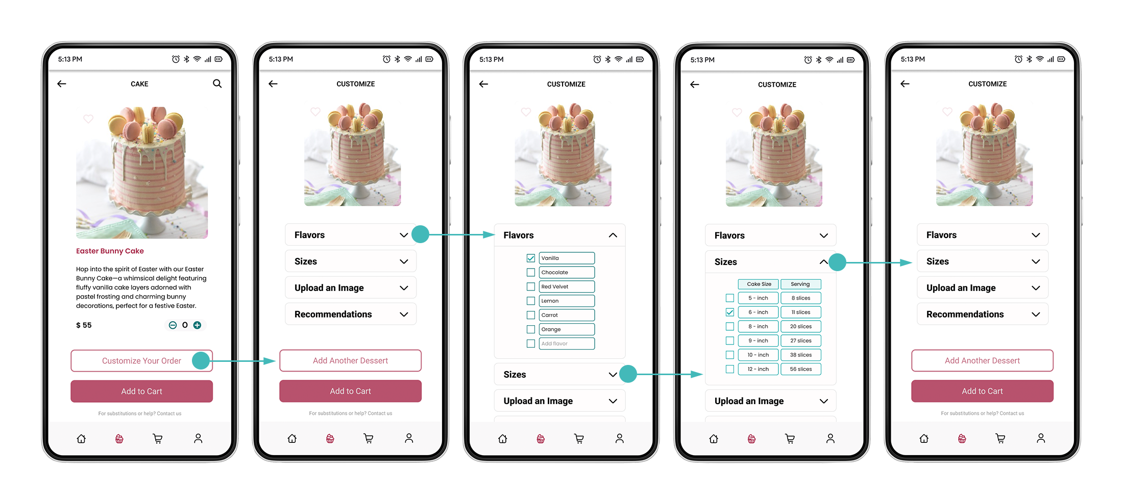
Excited, she goes to the customization options, selecting her daughter's favorite flavor, vanilla, and adjusts the size for the party.

Now she is headed to the checkout process. She reviews the order summary, securely inputs her paymeny details, input pickup details, and taps "Pay Now" to finalize. She receives a confirmation message with a unique order number and tracking instructions.

Curious, she explores the profile section, viewing her favorites, current orders, and past purchases and more. Satisfied, she eagerly awaits her daughter's birthday, confident the perfect cake will be ready.
LESSONS LEARNED
Final thoughts & Next Steps
User-Centric Design
Listening to users to understand their needs was crucial for creating effective solutions. It helped me grasp their desires and informed my design process. Without this, I risked creating something ineffective and wasting resources. They wanted a simple way to order desserts, track orders, pay securely, and receive personalized suggestions. Addressing these needs improved the overall user experience.
New Features & Additional Testing
Consider adding a Loyalty Rewards Program to give special deals and discounts to customers who come back often. It's also important to continue usability testing is paramount to collect more feedback and identify opportunities for further improvements.
Thank you!
Post-Launch Checklist:
Monitor these key performance indicators to gauge success and pinpoint areas for improvement:
Number of Downloads: to measure interest levels.
Conversion Rate: to evaluate app purchase transactions.
Return on Investment (ROI): Assess revenue generated versus development expenses.
Customer Satisfaction: to gauge user feedback and response to the app's performance.